Madison Colvin
Web Design
WWU Website Redesign

Project Overview
The spring of my freshman year, I took a web design class where we were tasked to redesign a pre-existing website with the HTML, CSS, and JavaScript we learned throughout the quarter. I chose to redesign Western Washington University’s website as I felt like the current UI was confusing and was unappealing. At the time I attended WWU and had personally struggled to navigate the website. Since my completion of this project WWU has revamped their website and has improved their overall design, but at the time the university had a very simple website that was not intuitive to use.
I have always loved art, design, and all things creative but it wasn’t until I took this introductory web design course, where I learned how to create aesthetic digital spaces, that I knew that I wanted to pursue a career in digital design. Specifically, this course sparked my interest in UX design and led me to the decision to pursue a full time career as a UX designer.
This project was my first attempt in creating an online environment from start to finish. For this project, I created the website from scratch in order to create a cohesive, creative design that meshed with Western’s existing brand. Before beginning to design the website, I created a list of all the things I thought was wrong with the current website design and planned how I could improve on each aspect. Through analyzing Western’s current website I discovered that the website was not easily navigable, didn’t encompass the brand’s image, and was not cohesive. In order to view what I wanted on the website I had to do a Google search for the information I needed, rather than searching internally within the university’s existing website.
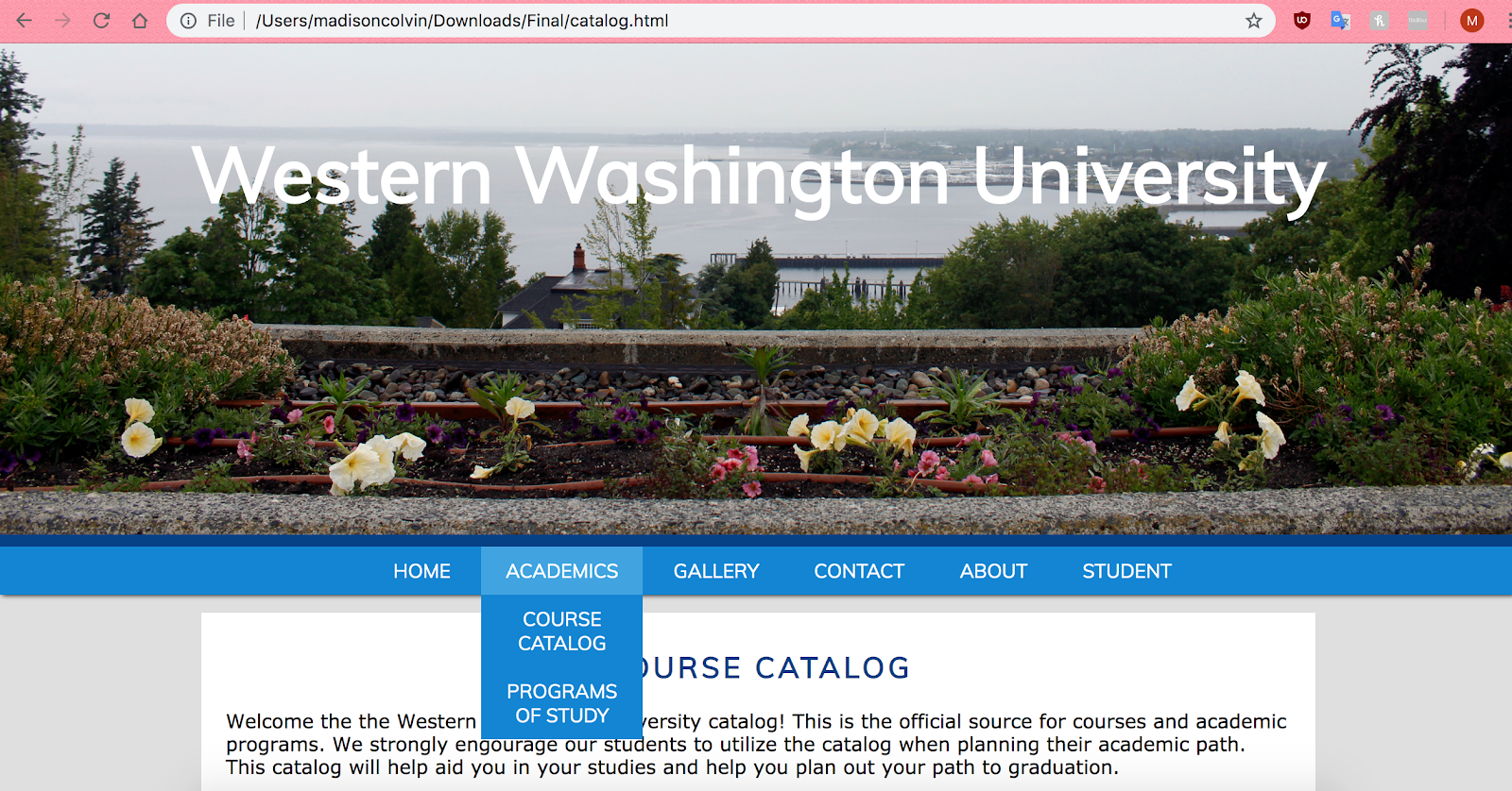
Below are some examples of my completed website. The website uses Western’s primary color scheme and images taken on campus to enhance and showcase the brand. I tried to make the website easily searchable via a simplified navigation bar. Additionally, I made sure that the website was the same throughout. Before the website’s pages seemed disjointed and varied in design, but in my final version I aimed to create design that was similar across all pages to give the user an enhanced experience.
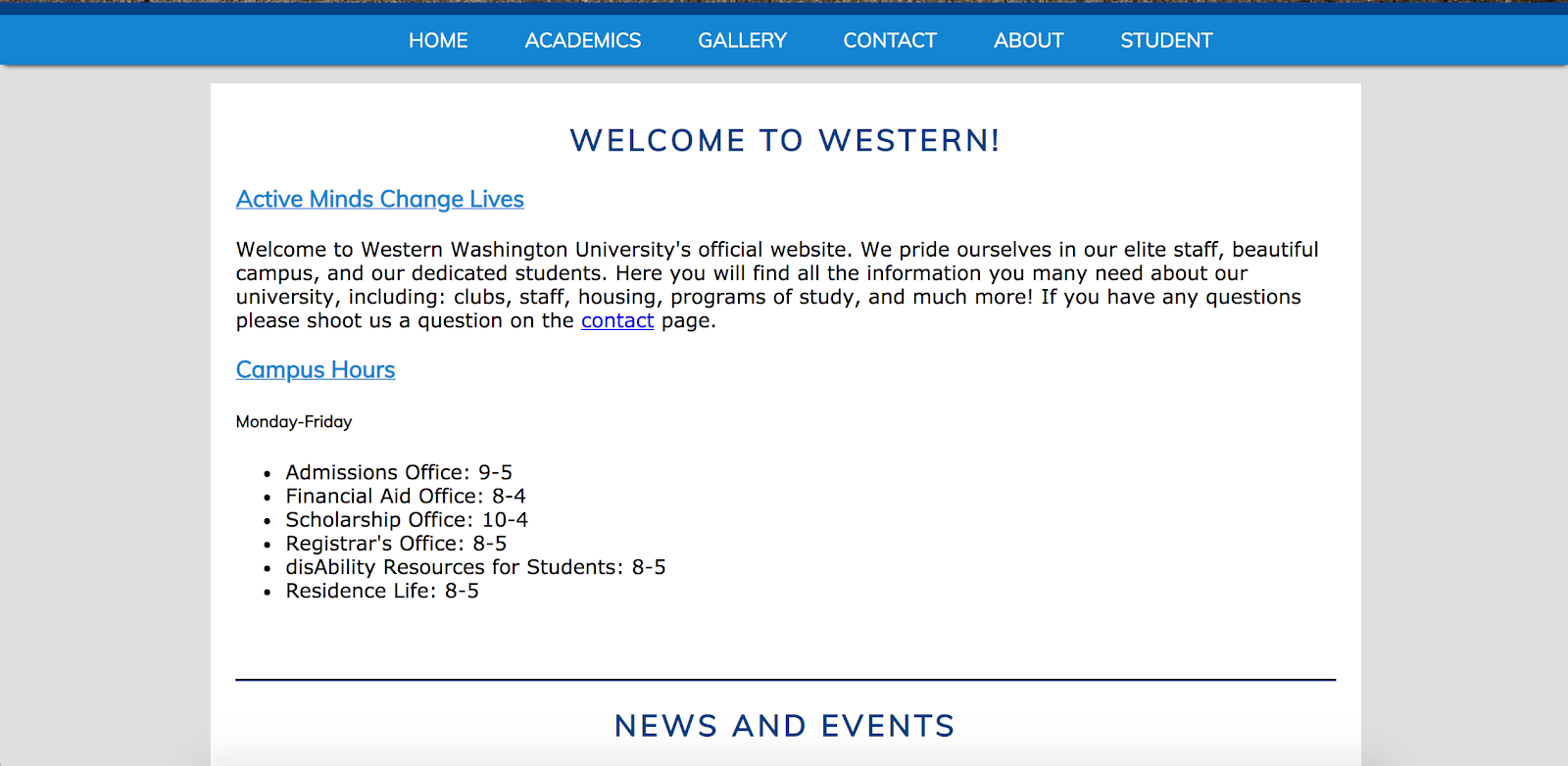
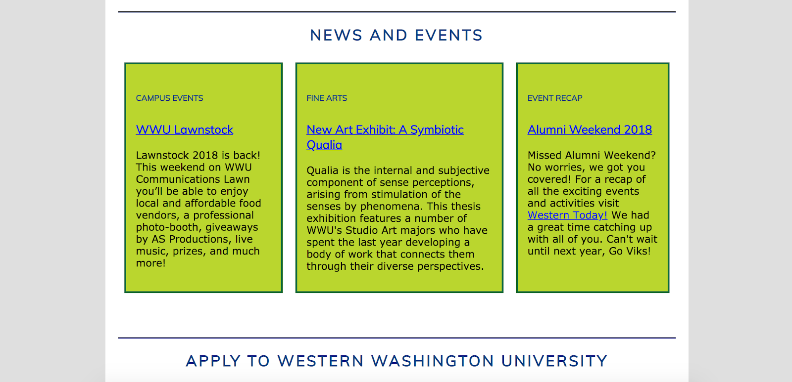
Home
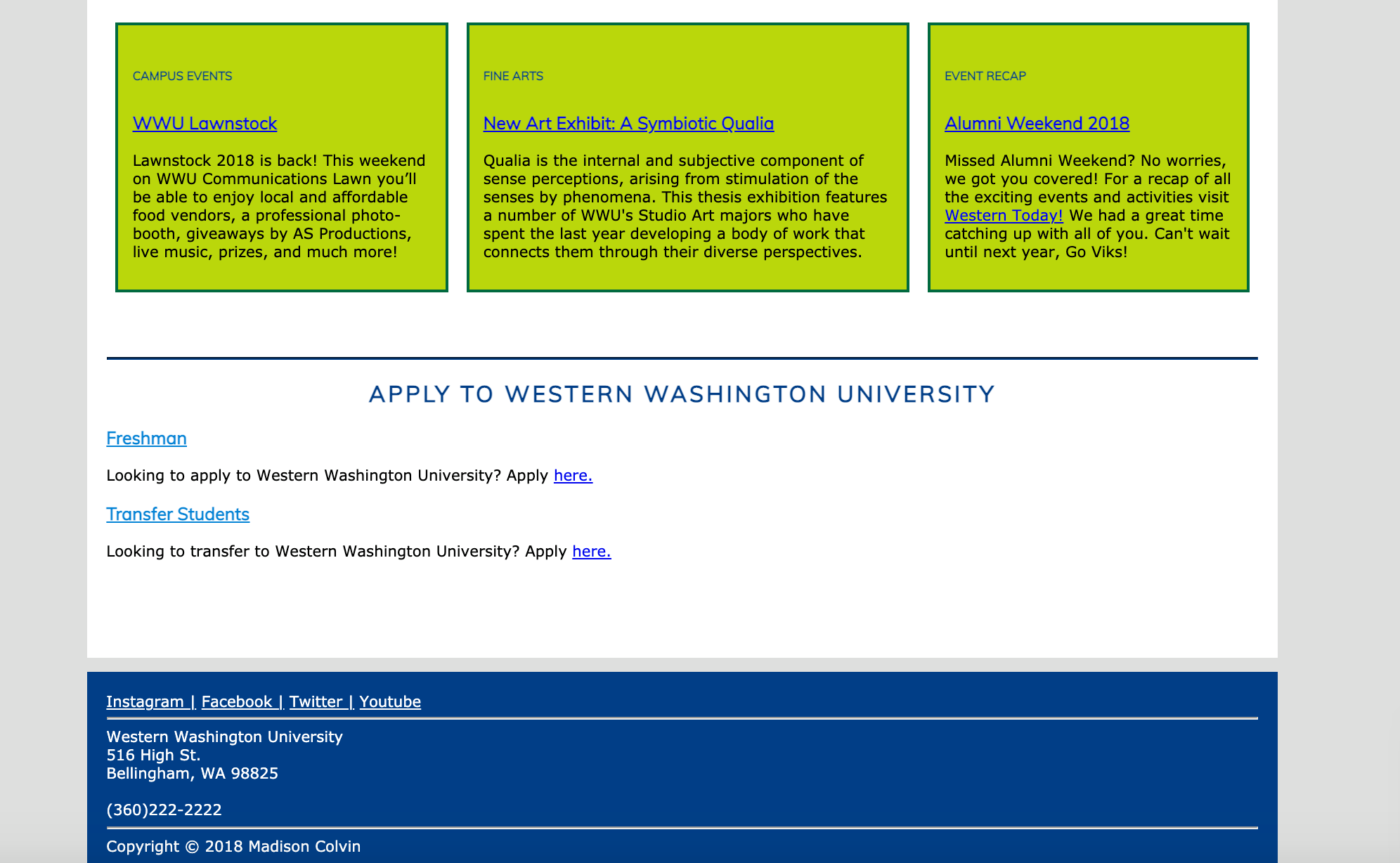
The landing page contains key information about the university. This page contains the university’s mission,
department hours, upcoming events, campus news, and the university’s contact information. I chose to feature this
information on the landing page as it was some of the most commonly sought after information and in the past I had
struggled to find some of this content on the university’s official website. By putting all this information on the
landing page, it simplifies users' experience on the site.
Gallery
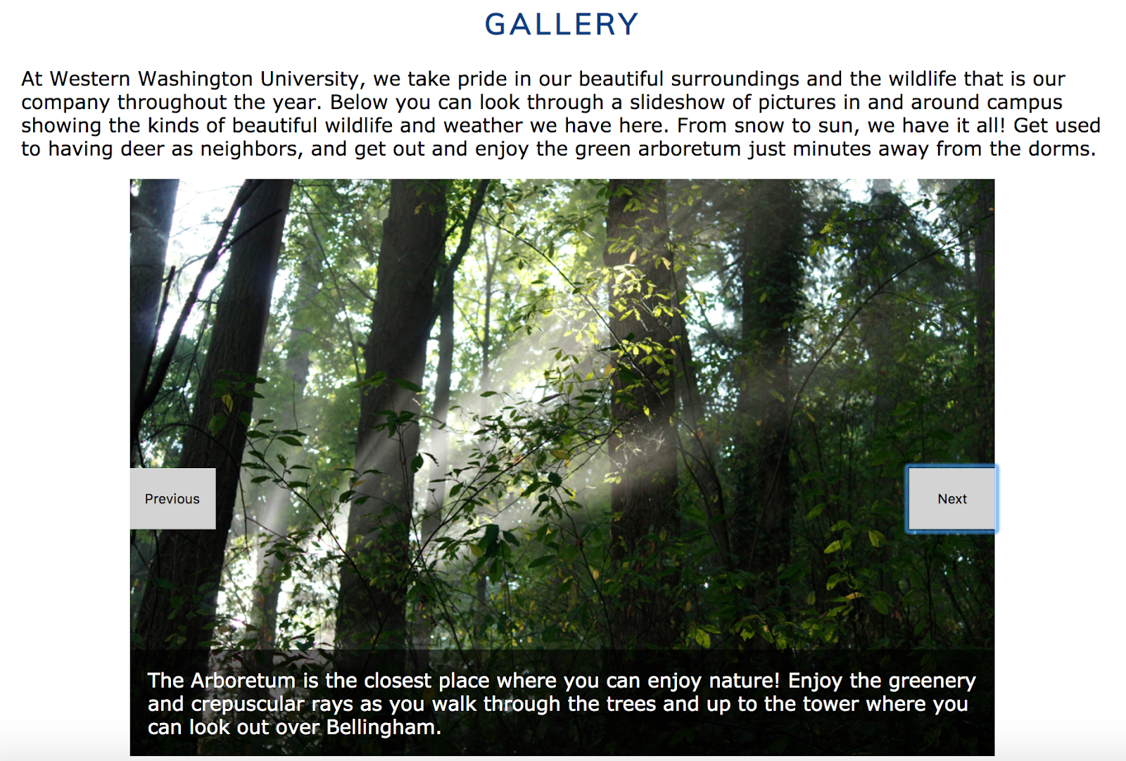
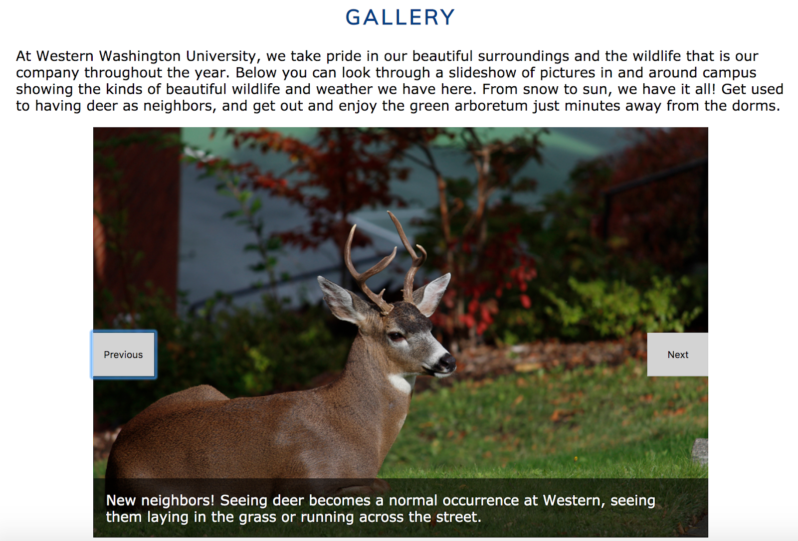
At the time, Western’s current website lacked visuals and did not have many pictures of campus.
The lack of imagery was detrimental to the brand as it made it difficult for prospective students to
know what the campus was like. Due to this, when creating my website design I made sure to incorporate
a number of visuals and include a gallery page that contained images of Western’s campus.
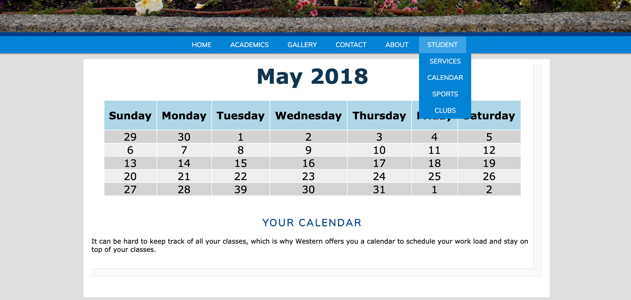
Calendar
In my website design I chose to include a digital calendar.
Users could choose to add Western specific events and classes in order to keep an organized schedule.
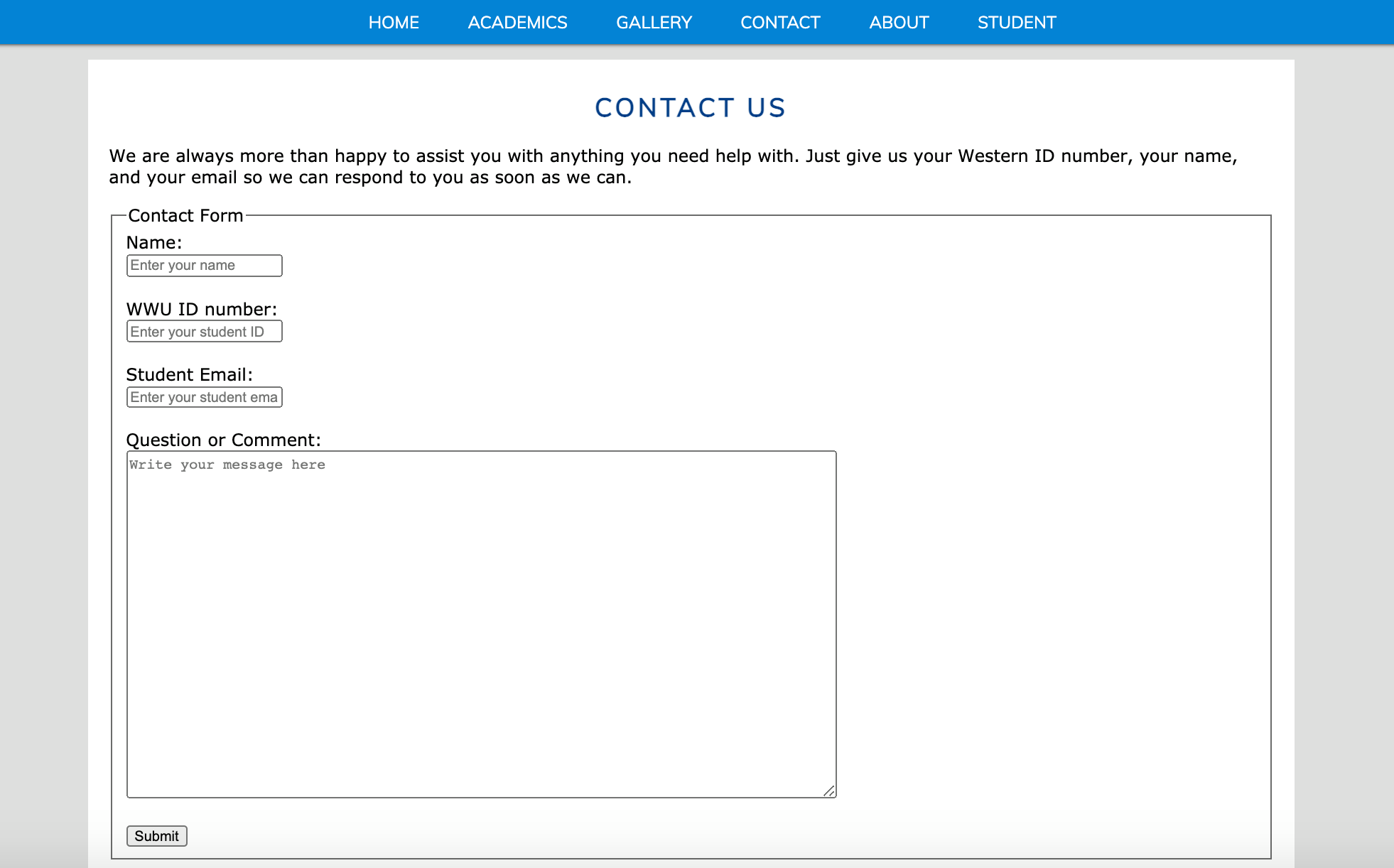
Contact Us
When navigating Western’s website I often struggled to find contact information.
In order to make this a simpler process for students, I chose to create a contact page that
allowed users to submit non-urgent questions.
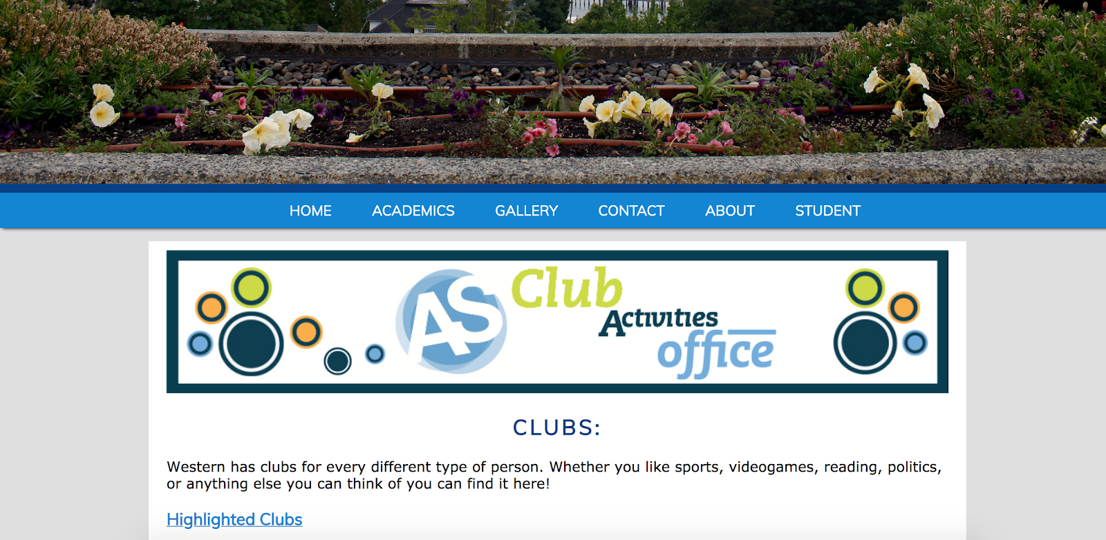
Clubs
When I created this website, I was a student at Western. As a student I always wanted to be more involved in the
university’s clubs, but besides attending the annual club fair it was difficult to know what clubs even existed.
Due to this lack of exposure, I created a club page that lists all of Western’s active clubs, meeting times, and
contact information for each club in hopes to increase accessibility.